Exercise 1: Add a native control to a Xamarin.Forms layout
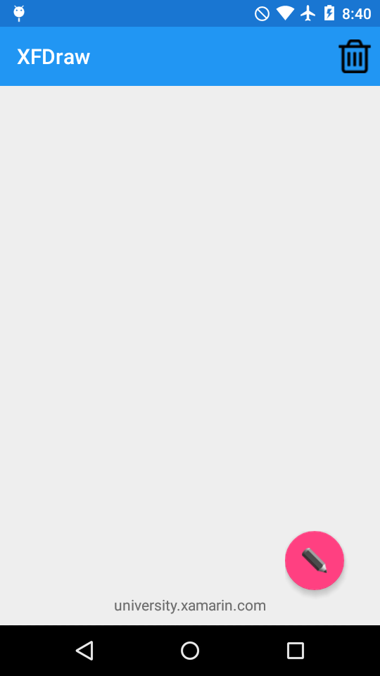
The primary goal of this lab is to embed a native control into Xamarin.Forms layout. Specifically, you'll add an Android Floating Action Button to a Xamarin.Forms grid. You'll start with an existing Xamarin.Forms solution with a minimal interface with no behavior defined in a shared project. You're going to use this project to create a Xamarin.Forms sketch app. You'll modify the code to replace a toolbar button with a native control when running on Android.

To complete the exercise, you will need Visual Studio for Windows or macOS with the Xamarin development tools installed. You will also need either an emulator/simulator or a device to run the exercise on. Please see the setup page if you need help installing the Xamarin development environment.
Open the starter solution
Open the XFDraw starter solution from the Exercise 1 > Start folder in your copy of the cloned or downloaded course materials in either Visual Studio on Windows or Visual Studio for Mac. There is also a Completed folder with a solution you can use to check your work. Please make sure you have these folders before you begin.
If you're using Visual Studio on Windows, you'll see all of the platform or head projects: iOS, Android and Windows. If you're using macOS, the Windows projects will be disabled (grayed out).
Create a platform specific control
In this exercise you'll embed a native control into Xamarin.Forms layout. Specifically, you'll add an Android Floating Action Button to a Xamarin.Forms grid.
- Open MainPage.xaml.cs in the XFDraw shared project.
-
Add the Android specific using statements for Android widgets:
Android.Support.Design.WidgetAndroid.Widget
-
Add the Xamarin.Forms Android platform using statement to gain access to the native embedding using statements:
Xamarin.Forms.Platform.Android. -
Add a using statement for
XFDraw.Androidso you can access types in the Android project. -
Surround the new using statements with an Android platform preprocessor directive to ensure they're only compiled by the Android head-project.
#if __ANDROID__ using XFDraw.Droid; using Xamarin.Forms.Platform.Android; using Android.Widget; using Android.Support.Design.Widget; #endif - In the constructor, find the code to create the "New Color" ToolbarItem.
- Add an Android preprocessor directive with a matching else statement so the "New Color" button is created on every platform except Android.
-
For Android only, create a new
FloatingActionButton. In the Android head-project, a static property namedActivityhas been added that you can pass in as the context. -
Set the image resource to the included pencil image. You may need to fully qualify the namespace:
XFDraw.Droid.Resource.Drawable.pencil. -
Handle the button's
Clickevent handler and call the providedOnColorClickedmethod. -
Create an Android Frame Layout to hold the button. As you create the FrameLayout, you'll want to set it's size large enough to hold the button as well as the button's drop-shadow. You have two options to choose from when setting the FrameLayout size. The first option is to call
SetPaddingwith large enough values to contain the button's drop-shadow. The second option is to set the margin on the Xamarin.Forms frame which you'll create in a next step. TheSetPaddingoption makes use of pixels to adjust the size where as setting a margin will make use of device independent pixels (DIPs). DIPs is the recommended implementation. The instructions below shows theSetPaddingoption, however it has been commented out. You'll rather want to fix sizing when embedding the native view in our next step. -
As a last step make sure to set the
SetClipToPaddingto false to ensure the drop-shadow is visible.
#if __ANDROID__
   var actionButton = new FloatingActionButton(MainActivity.Activity);
   actionButton.SetImageResource(XFDraw.Droid.Resource.Drawable.pencil);
   actionButton.Click += (s, e) => {
      OnColorClicked();
   };

   var actionButtonFrame = new FrameLayout(MainActivity.Activity);
   actionButtonFrame.SetClipToPadding(false);
   //actionButtonFrame.SetPadding(0, 0, 50, 50); - This will use pixels to set the size and not recommended.
   actionButtonFrame.AddView(actionButton);
#else
   ToolbarItems.Add(new ToolbarItem("New Color", "pencil.png", OnColorClicked));
#endif
Embed the native control
With your Android FloatingActionButton ready and wrapped in a FrameLayout large enough to display it entirely, you'll put it in your main Forms Grid layout.
-
Call the
ToViewextension method on theFrameLayoutinstance and save it to a local variable. -
You'll place the button in the lower-right corner of the grid: set both the
HorizontalOptionsandVerticalOptionstoLayoutOptions.End. -
Recall from earlier that you'll have to set up the View so that both the button and it's drop-shadow fits into the native layout. You want to do this by relying on the Xamarin.Forms rendering engine that will set the value using the platform specific rendering units. On Android this value will be translated into DIPs. Set the
Marginof the View to an appropriateThinkness. -
Add the view to mainLayout's Children collection.
var actionButtonFrame = new FrameLayout(MainActivity.Activity); ... var actionButtonFrameView = actionButtonFrame.ToView(); actionButtonFrameView.HorizontalOptions = LayoutOptions.End; actionButtonFrameView.VerticalOptions = LayoutOptions.End; actionButtonFrameView.Margin = new Thickness(25); mainLayout.Children.Add(actionButtonFrameView); - Run the application on Android and one other platform.
Exercise summary
In this exercise, you created a platform-specific native control and embedded it into a Xamarin.Forms layout.
You can view the completed XFDraw solution in the Exercise 1 > Completed folder of your copy of the cloned or downloaded course materials.