Exercise 5: Use the built-in ImageCell (XAM280)
This final exercise will provide a better visualization for the rows so that you see the image, country and date adopted.
To complete the exercise, you will need Visual Studio for Windows or macOS with the Xamarin development tools installed. You will also need either an emulator/simulator or a device to run the exercise on. Please see the setup page if you need help installing the Xamarin development environment.
Open the starter solution
This exercise is a continuation of the previous exercise. You can use your existing solution or begin from the prior Exercise 4 > Completed solution in your copy of the cloned or downloaded course materials.
Add a DataTemplate to the ListView
The first thing you need to do is assign a DataTemplate definition to the ListView.ItemTemplate property.
- Open the AllFlags.xaml markup page.
- Assign the
ListView.ItemTemplateproperty to a newDataTemplate.
<ListView ItemsSource="{Binding Flags}"
          SelectedItem="{Binding CurrentFlag, Mode=TwoWay}"
          ItemTapped="OnItemTapped"
          IsPullToRefreshEnabled="True"
          Refreshing="OnRefreshing">
    <ListView.ItemTemplate>
        <DataTemplate>

        </DataTemplate>
    </ListView.ItemTemplate>
</ListView>
Define an ImageCell for our row visualization
Next, you need to supply the visual instructions for the row - these go into the DataTemplate definition. The ListView requires that this always be a Cell type, so you'll use an ImageCell here.
- Inside the
DataTemplate, define anImageCell. - Set the
DetailColorto "Gray". -
Remember that the
BindingContextfor the row will be a singleFlagobject definition. Apply{Binding}values for the following properties.Text>Country.Detail>DateAdopted, use theStringFormat"'Adopted on {0:d}'".
<ListView.ItemTemplate>
    <DataTemplate>
        <ImageCell DetailColor="Gray"
                    Text="{Binding Country}"
                    Detail="{Binding DateAdopted, StringFormat='Adopted on {0:d}'}" />
    </DataTemplate>
</ListView.ItemTemplate>
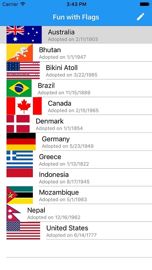
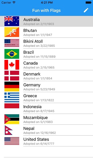
Run the application to see what it looks like now, you should see something like this.


Notice how the flags are different sizes on iOS and UWP, but not on Android? In fact on UWP, they are massive images because the native control rendering them goes ahead and uses the full size of the image! You'll look at ways to fix this problem in XAM312 - Customizing ListView but for now, you can provide smaller images which are the correct scale/size for displaying in a list. The completed version of this lab adds a new property to the Flag "SmallImageUrl" which has a much smaller image of each flag using a consistent size with a 4px transparent border around it.
Do the final image binding on the ImageCell
The last step is to provide the ImageSource for our ImageCell.
- You need a Value Converter to load the images for our ListView. You already have one setup in the details page. You just need to move it to a more global scope so it's available in your list page. Open the FlagDetailsPage.xaml markup page and move the
ResourceDictionaryinto theApp.xamlfile. You'll need to move the namespace definitions for the converters (xmlns:cvt) and data (xmlns:data). - Next, open the AllFlags.xaml file and data bind the
ImageCell.ImageSourceproperty to theImageUrlproperty using the converter. Check the syntax in theFlagDetailsPagepage where it uses the same converter for theImageif you need some guidance. - Run the application to see the final results and then comment this code out and try it in code behind.
<!--Application XAML-->

<Application...>
    <Application.Resources>
        <!-- Application resource dictionary -->
        <ResourceDictionary>
            <cvt:EmbeddedImageConverter x:Key="irConverter"
                ResolvingAssemblyType="{x:Type data:Flag}" />
            </ResourceDictionary>
        </Application.Resources>

<!--Page XAML-->

<ImageCell DetailColor="Gray"
    ImageSource="{Binding ImageUrl, Mode=OneWay, Converter={StaticResource irConverter}}"
    Text="{Binding Country}"
    Detail="{Binding DateAdopted, StringFormat='Adopted on {0:d}'}" />

Notice how the flags are different sizes on iOS and UWP, but not on Android? In fact on UWP, they are massive images because the native control rendering them goes ahead and uses the full size of the image! You'll look at ways to fix this problem in XAM312 - Customizing ListView but for now, you can provide smaller images which are the correct scale/size for displaying in a list. The completed version of this lab adds a new property to the Flag "SmallImageUrl" which has a much smaller image of each flag using a consistent size with a 4px transparent border around it.

Exercise summary
In this exercise, you provided a new row visualization for the ListView so you can see an image and some details about the contact prior to selecting them.
You can view the completed solution in the Exercise 5 > Completed folder of your copy of the cloned or downloaded course materials.