Exercise 3: Use Grid to build a UI
The goal of this lab is to use a Grid to arrange the views in a UI.
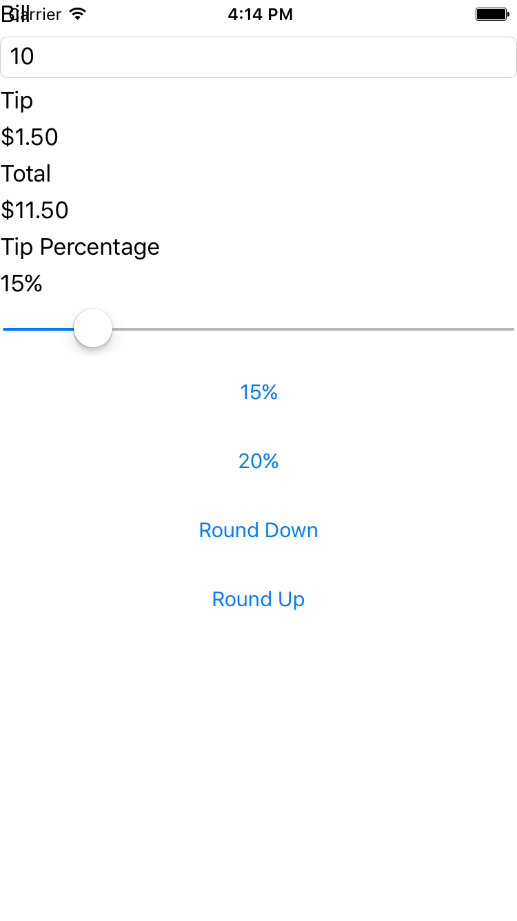
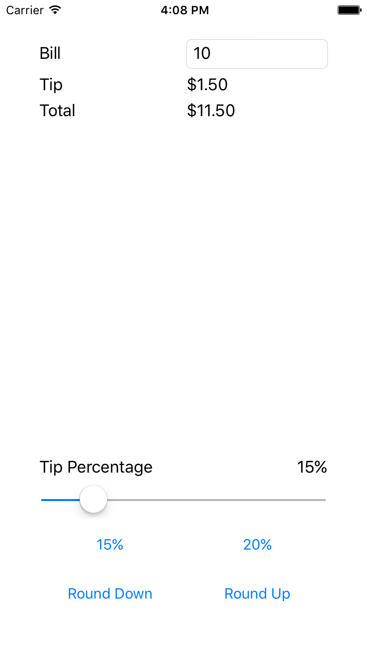
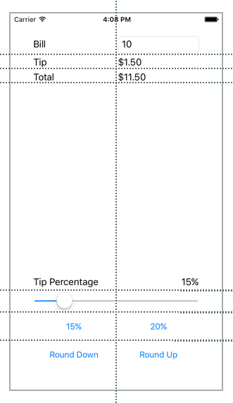
The first screenshot below shows the Starter project and the second shows the Completed project. Your job is to use a Grid to turn the starter project into the completed version. There is no single "correct" answer here. Use your judgment to produce a UI that looks good to you.
The images shown above may be sufficient to allow you to complete the lab. If you would like addition guidance, please use the steps on the next pages.
To complete the exercise, you will need Visual Studio for Windows or macOS with the Xamarin development tools installed. You will also need either an emulator/simulator or a device to run the exercise on. Please see the setup page if you need help installing the Xamarin development environment.
Open the starter solution
Open the Tip Calculator starter solution from the Exercise 3 > Start solution in your copy of the cloned or downloaded course materials in either Visual Studio for Windows or Visual Studio for Mac.
Create a grid layout
This section gives step-by-step guidance to create the Grid for the TipCalculator UI as it was pictured in the Completed screenshot. Attempt to create the UI yourself before following these steps. If you have already created the rows and columns based on the high-level goals given earlier, you can either review these instructions or skip to the next section.
- Open MainPage.xaml. All your work will be done in this file; there is no need to modify the code-behind.
-
Before we design the
Grid, addPaddingto the page to avoid overlap of the UI and the iOS status bar. TheTopvalue for thePaddingshould be at least20. -
Change the layout from a
StackLayoutto aGrid. -
Define 7 rows and 2 columns for the
Grid. The image below shows the rows and columns used by the Completed project. All the rows areAutosize except the fourth row, which uses*, so it will be allocated all the extra space. The columns both use*sizing. Note that*is the default; however, the Completed solution uses it explicitly for clarity.
The row and column definitions are provided below.
<Grid.RowDefinitions>
  <RowDefinition Height="Auto" />
  <RowDefinition Height="Auto" />
  <RowDefinition Height="Auto" />
  <RowDefinition Height="*" />
  <RowDefinition Height="Auto" />
  <RowDefinition Height="Auto" />
  <RowDefinition Height="Auto" />
</Grid.RowDefinitions>

<Grid.ColumnDefinitions>
  <ColumnDefinition Width="*" />
  <ColumnDefinition Width="*" />
</Grid.ColumnDefinitions>
Position views in cells
This section gives step-by-step guidance to add views to the Grid for the TipCalculator UI as it was pictured in the Completed screenshot. Attempt to create the UI yourself before following these steps. If you have already finished the exercise based on the high-level goals given earlier, you can either review these instructions or skip to the next section.
- Add settings for
Grid.RowandGrid.Columnto each of the views to assign them to the appropriate cell in the grid. Note that both of these default to0; however, it is fairly common to assign this value explicitly for clarity. The code below shows an example of this syntax.
<Slider Grid.Row="4" Grid.Column="0" ... />
- Align the "Bill"
Labeland theEntryby settingVerticalOptionstoCenteron theLabel(see below).
<Label Text="Bill" VerticalOptions="Center" ... />
- Add a setting for
Grid.ColumnSpanto theSliderso it spans both columns.
<Slider ... Grid.ColumnSpan="2" ... />
- Locate the
Labelwith text of "Tip Percentage". Set it so it will occupy the bottom-left spot inside its rectangle (see below).
<Label Text="Tip Percentage" VerticalOptions="End" HorizontalOptions="Start" ... />
- Locate the
Labelwith a name oftipPercent. Set it so it will occupy the bottom-right spot inside its rectangle (see below).
<Label x:Name="tipPercent" VerticalOptions="End" HorizontalOptions="End" ... />
- Run the app to test your work.
Exercise summary
In this exercise, you used a Grid to improve the aesthetics of an existing UI. Grid is more powerful than StackLayout; in particular, Grid makes it easy to align views across different rows.
You can view the completed solution in the Exercise 3 > Completed folder of your copy of the cloned or downloaded course materials.