Exercise 1: Create and lay out a single view application
The primary goal of this lab is to teach you how to create a new iOS application and add a basic UI using the iOS Designer.
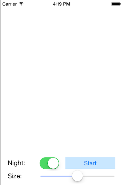
The finished UI should look something like this:
To complete the exercise, you will need Visual Studio for Windows or macOS with the Xamarin development tools installed. You will also need either an emulator/simulator or a device to run the exercise on. Please see the setup page if you need help installing the Xamarin development environment.
Create the Fireworks application
-
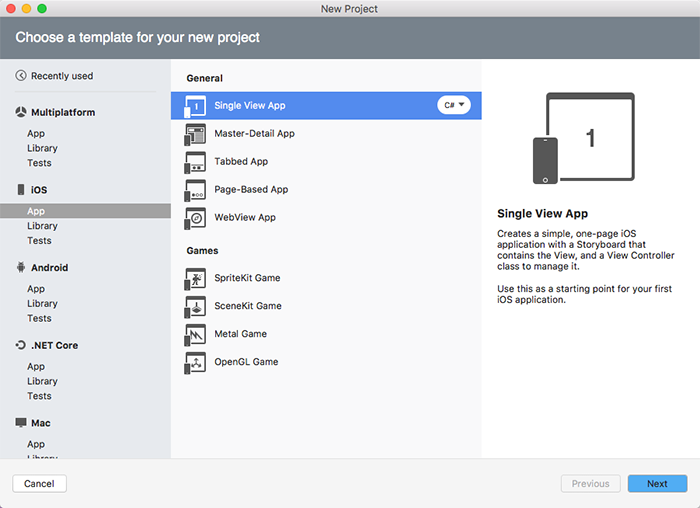
Create a new iOS application using the iPhone ➤ Single View App template.
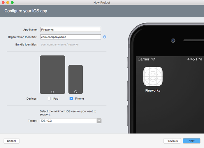
- Name it Fireworks.

- Create a new iOS application using the Single View App template.
- Name it Fireworks.
- Uncheck iPad from the supported devices.
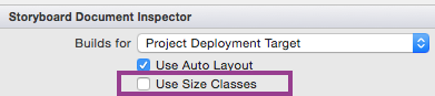
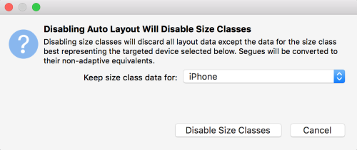
Disable size classes
The iOS Designer includes support for Size Classes. These are APIs that can be used to fine-tune your UI based on device screen size. For simplicity we won't be using Size Classes in our exercises but they're a great feature to explore once you're comfortable with Auto Layout.
- Open Main.storyboard and wait for the designer to load.
- Click on the design surface outside of the view controller. This will give you access to the properties for the storyboard.
- In the Properties pane, uncheck Use Size Classes.

- In the popup, choose to keep size class data for iPhone and click Disable to dismiss the dialog.

- Open Main.storyboard and wait for the designer to load.
- Click on the design surface outside of the view controller. This will give you access to the properties for the storyboard.
- In the Properties pane, uncheck Use Size Classes.
- In the popup, choose to keep size class data for iPhone and click Disable to dismiss the dialog..
Add labels
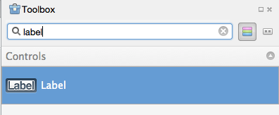
- Look in the Toolbox for a Label. Tip: To find your views more quickly, you can use the Search Bar at the top of the Toolbox.

- Drag a label to the lower left corner of the view controller on the design surface. Make use of the blue guidelines to help you with spacing.
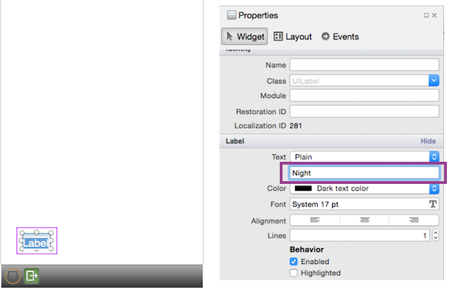
- Double click on the top label to change its text to Night:. You can do this on the storyboard or in the properties pane.

- Drag a second label and place it below the first and align them on the left edge.
- Change the text on the lower label to Size:.
- Use the round dragging controls to expand the width of both labels to make sure the text is completely visible.
- Look in the Toolbox for a Label. Tip: To find your views more quickly, you can use the Search Bar at the top of the Toolbox.
- Drag a label to the lower left corner of the view controller on the design surface. Make use of the blue guidelines to help you with spacing.
- Double click on the top label to change its text to Night:. You can do this on the storyboard or in the properties pane.
- Drag a second label and place it below the first and align them on the left edge.
- Change the text on the lower label to Size:.
- Use the round dragging controls to expand the width of both labels to make sure the text is completely visible.
Add additional controls
- Search for a Switch in the Toolbox and place it to the right of the first Label (Night:).
- Search for a Button and place it to the right of the Switch you just added.
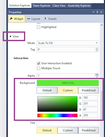
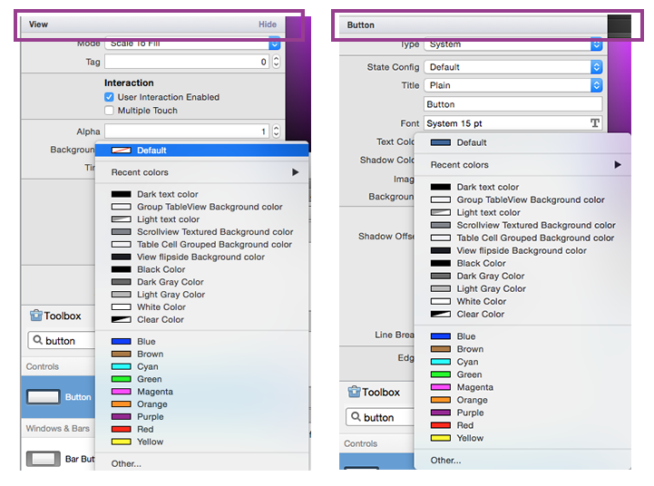
- Use the Properties pane to set the button's Background.
- You will find this under the View section in the Property pane when the button is selected.
- You will need to change the color from Default to Custom to select a custom color from the color picker as shown below. The completed solution uses green, but feel free to pick the color you prefer.
- Depending on the color you choose, you may need to change the Text Color property under the Button section to make it visible.
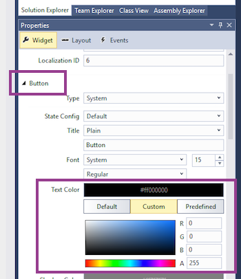
- Change the Title of the button to Start using the properties pane.
- Search for a Slider and add it to the right of the bottom label.
- Expand the width of the slider to take up the remaining width of the screen.
- Search for a Switch in the Toolbox and place it to the right of the first Label (Night:).
- Search for a Button and place it to the right of the Switch you just added.
- Use the Properties pane to set the button's Background Color. You will find this under the View section. The completed solution uses Green, but feel free to pick the color you prefer. Depending on the color you choose, you may need to change the Text Color under the Button section to make it visible.
- Change the Title of the button to Start using the properties pane.
- Search for a Slider and add it to the right of the bottom label.
- Expand the width of the slider to take up the remaining width of the screen.
Run the application
- Compare your screen to the finished lab and make sure it looks similar.
Once you're satisfied with the results, run the application using the iOS simulator.
Try rotating the device using the Hardware menu. Try different simulator sizes - iPhone 4s, iPhone 5, iPhone 6, iPhone 6 Plus, etc. to see what happens to the controls.
Did you notice that the controls don't adjust to screen size or orientation? Maybe they disappeared or moved to a different location on the screen. That's because we dragged the controls onto the view surface in the designer and set the frame. The problem is that this is a fixed positioning mentality. The controls stay in that position regardless of the orientation or what type of device you're using.
How do we correct this problem of having our controls in a fixed position? Check out the next section to learn how to make your app more responsive.
Exercise summary
Congratulations! In this lab you created a new single view iOS application and used the Xamarin.iOS Storyboard Designer to create the UI.
You can view the completed solution in the Exercise 1 > Completed folder of your copy of the cloned or downloaded course materials.